Category

Perspective

Category

«MC Eyewear» is a joint collaboration between the artist Michel Comte and Optiker Zwicker. Three eyewear models that can be worn as both aids to vision and sunglasses.

Actually, Michel Comte just wanted something to eat, but then he met Yves Saint-Laurent in the Kronenhalle in Zurich. Comte, then 18, was impressed. By Saint-Laurent himself, but even more by what he wore on his nose. The fashion designer’s glasses fascinated him so much that he went on to design his own model and had it made by the oldest optician in Zurich – Optiker Zwicker. Since then he has had many more custom glasses made, in different locations and in a variety of styles. But now he has created a joint collaboration with Optiker Zwicker: the «MC Eyewear» collection. Three models, designed by Comte and realised to perfection by Optiker Zwicker.

The highlight: each model can be made as both an aid to vision and sunglasses. The bottom line: Comte returns to his roots. And that makes him happy, as it does the owner of Optiker Zwicker, Daniel Halder: «It is a great pleasure to be part of its history and to offer these brilliant designs exclusively.» And Comte himself says: «Today I’m back in my hometown and am lucky enough to be working with Optiker Zwicker – where it all began – and launching a special eyewear collection.»

Uniqueness in view

For both Comte and Zwicker, glasses are more than just a visual aid. They are a reflection of the wearer’s personality and emphasises a person’s character. «The glasses in this collection are for people who want to make a statement,» emphasises the artist. «They are for everyone who knows that glasses not only improve vision, but also underline their personality.» The models are inspired by a pair of glasses that Comte himself wore for many years and which became an important companion. A pair of glasses that he discovered by chance in a vintage shop, but which captivated him just as much as Saint-Laurent’s glasses once did.

The glasses themselves are particularly impressive because of their frames – they are not delicate. They are eye-catching and distinctive. And they also have special names: Nearco, Luna and Bianca. The three models in the collection were named after important characters in Comte’s life: Nearco was his racehorse, Luna was his dog’s name and he called his cat Bianca, in tribute to social and human rights activist Bianca Jagger.

Photos Copyrights: Michel Comte, Optiker Zwicker

«Bucherer exclusive» represents a special edition of the swiss luxury retailer and, at the same time, high-quality watchmaking. The timepieces from renowned manufacturers are available as special editions and are sometimes very limited.

Perfection and uniqueness are two of the cornerstones of the art of watchmaking. Something that the Swiss company Bucherer, a household name, values. Anyone looking for the perfect watch for them in Zurich will find it right here – in the five-storey building at Bahnhofstrasse 50. «Bucherer Exclusives» also stands for precision craftsmanship, unmistakable design and finesse. The exclusive pieces, almost all of which are limited editions, were created by Bucherer in an exclusive partnership with renowned manufacturers such as H. Moser & Cie. and Ulysse Nardin, to name just a couple. Around 40 very special models have been created so far and this is what gets lovers of beautiful timepieces in a really enthusiastic mood. Extraordinary, experimental and exclusive.

Girard-Perregaux

For now, let us start with the special edition of the Laureato chronograph made by «Girard-Perregaux». The over 200-year-old manufacture based in La Chaux-de-Fonds represents the fact that a timepiece is so much more than just what is needed to find out the time. The dial of this Special Edition features a silver «Clous de Paris» pattern and blue auxiliary dials, in other words, a colour scheme that echoes Bucherer’s signature colours.

However, the model naturally continues to display its characteristic features – such as the raised, octagonal bezel – in style; after all, it makes the Laureato collection, which has been available since 1975, one of the most popular of the «Girard-Perregaux» brand. The same applies to the seamless transition of the steel case and bracelet. This special model is definitely worth a second look for those who embrace extravagance on their wrist.

Breitling

Another masterpiece, this time from Breitling, has also been given a new look thanks to the «Bucherer Exclusive» collection. In this joint project between Bucherer and Breitling, the “Superocean” has been reissued as a stylish trio in three versions. The «Superocean Automatic 44» impresses with its light blue dial and ceramic inserts. So does its smaller sister, which, with a diameter of 36 mm, also fits somewhat narrower wrists. And the third watch in the collection is the «Superocean Automatic 42». It is a real eye-catcher thanks to its burgundy red-coloured minute scale and a bezel in red gold. However, there are only 88 pieces available of each, so Breitling fans should hurry.

The history of the «Superocean» is legendary, as it was the first diver’s watch that Breitling brought onto the market and has demonstrably shaped the company and its direction. Whether diving, swimming or sailing, the desire for a reliable companion for water sports was becoming increasingly important in the 1950s. And Breitling’s «Superocean» was able to fulfil said desire with style. Over the years, the model has been modified step by step. That, above all, meant more technology and even better readability. In the end, the «Slow Motion» version was born, which has lost none of its popularity to this day.

L’Epee 1839

And yes, when we talk about timepieces, we can also think of time travel. With the «Bucherer Exclusive Time Machine», Bucherer has brought this illusion known from science fiction films to life in the form of a table clock. Or in other words, brought them to life together with the L’Epée 1839 brand. The mechanical sculpture is very reminiscent of a time capsule. The fascinating look, futuristic design and moving elements of the sculpture are skilfully combined with all the refinements of watchmaking. The time capsule – glass tube, time display and the entire mechanical movement – can be set in rotation. This timepiece is definitely one of the most unusual items in the «Bucherer Exclusive» collection and one of the newest. The collector’s item is limited to 20 pieces worldwide.

Photos Copyrights: Bucherer

As one of Germany’s most talented architects, Sigurd Larsen designs extraordinary houses and hotels. His design studio combines the aesthetics of high-quality materials with functionality and complex contexts. What is particularly important to him when designing is the interaction with daylight and the embedding of the building in a strong narrative.

You were born in Denmark, why did you choose Berlin as your adopted home?
Sigurd Larsen: I ended up here for pragmatic reasons. After studying in Copenhagen, I got my first job in Berlin. I was here often anyway and thought the city was great. And finally, every well-known Dane has lived in Berlin for some time, from Sören Kierkegaard to Hans Christian Andersen. If you travel south from Copenhagen, Berlin is the first big city, so I’m not far away. My parents live in Aarhus. Whether you visit my sister in Copenhagen or me in Berlin, there is hardly any difference in distance. I just had to get used to the different culture and language here.

What rules or values do you use to design your projects?
There is no predetermined format where I say it has to be one way or the other for it to be a project from our office. I go out of my way to avoid doing so. I’m much too curious and am always trying new things. But if we are talking about the fact that I come from Denmark, a focus of my projects is on daylight and in general the use of light, with materials of solid durability. I also attach great importance to high quality craftsmanship. Partly it has to do with my origins but I think a Japanese or a Swiss person can say the same about their homeland.

You recently completed the Lakehouse in West Berlin, what was the design idea?
The Lakehouse is a public facility for sport and exercise; you can also rent the house for seminars, events or exhibitions. It’s a great place by a lake on the border with Brandenburg. It consists of several small areas so that events can take place at the same time. It also gives you a scale that feels more like a big house with a kitchen than an airport lobby, and that was the intention. Of course there is also the interaction with daylight: on one side of the building the sun shines through a forest in the morning – incredibly beautiful light. Throughout the day it moves around the building, which is fanned out in all directions towards the lake. And there is a beautifully framed sunset. It is a beautiful experience when the sun is low, the sun shines through the treetops and reflects in the lake. That’s why we installed these large windows to catch the beautifully filtered light. In addition, the house was built by a Swiss company from exceptionally prefabricated wooden elements; it was supposed to be state of the art with integrated power cables.

Lakehouse, Berlin

Exciting! Your own house in Greece looks completely different.
Yes, it’s called Piperi, which means pepper in Greek – the name comes from the small island on which the house stands. I totally fell in love with the property and the views of this uninhabited island. The house faces east towards the sunrise, on the other side you can enjoy the sunset, which is beautiful. However, there was a strict development plan there, one of the strictest in Europe. Piperi is a very well preserved island with very few tourists. All the houses are white cubes with white stairs and that’s how I wanted to design my house, even though I was forced to do so due to the local building culture. There are also rules about proportions, windows and all sorts of things. We wanted to build a house that had the same exciting, almost labyrinthine feeling as the small Greek villages with their countless stairs. It was extremely interesting to deal with the building culture and local crafts.

Piperi, Greece

And what was the challenge with the Glass House in Uckermark?
The Glass House is a weekend house for a family from Berlin, which is also rented out. The idea was that you come from Berlin, walk through the door and suddenly you’re in this other quiet world and look at the landscape. We wanted to create added value with the attic, realised that the view up there is extremely beautiful and that’s how the idea of the transparent roof came about. Instead of bricks we used glass, otherwise it is a typical wooden roof construction. Our photographers came back one day with incredible pictures of the sunset that made the whole house look like Ayers Rock in Australia, from yellow to red to purple. To be honest, we weren’t really aware of the effect when we built it and it turned out much better than we thought.

Glass House, Uckermark

How do you think we will live in the future, what will change?
The last small living revolution occurred during the pandemic, when suddenly everyone at home was equipped with a home office. Previously there was a lot of talk about offices being more homely and suddenly there was actually a movement towards home. But how we build our houses is also important: we see among the younger generations a desire to build significantly smaller houses today, with less material. This must be made possible so that they can be approved.

You also design hotels, currently one in Crete. What makes a successful hotel for you?
A really good hotel always has to have a theme. This doesn’t have to be big. At the Michelberger Hotel in the Spreewald, for example, the theme is gastronomy and all of the building’s materials were – similar to food – lifted from the earth, baked, fired or oiled. You can feel the connection between gastronomy and architecture and you can look after yourself in the large garden next door. The guests sleep under the roof, are directly connected to the large common room in the morning and you can smell breakfast being prepared there. You live in the middle of it all and can see the garden all the time, where you can taste, smell and touch everything. This is a clear theme for a hotel and it works wonderfully.

Photos Copyrights: Tobias Koenig, Michael Romstoeck

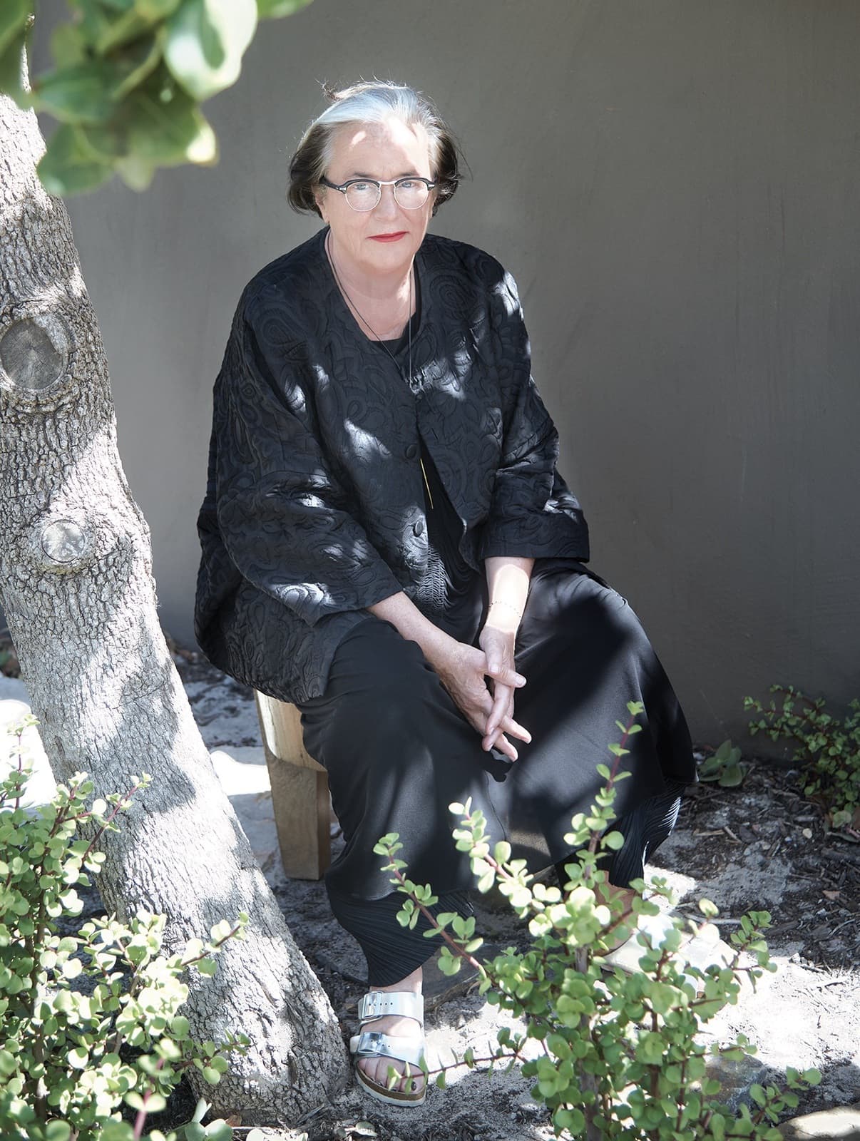
Tobias Rehberger’s most personal exhibition in Copenhagen to date shows not only his artworks and snapshots but also objects which he has «amassed» over the years, as he says. But why? He unravels this mystery for us in the interview. 

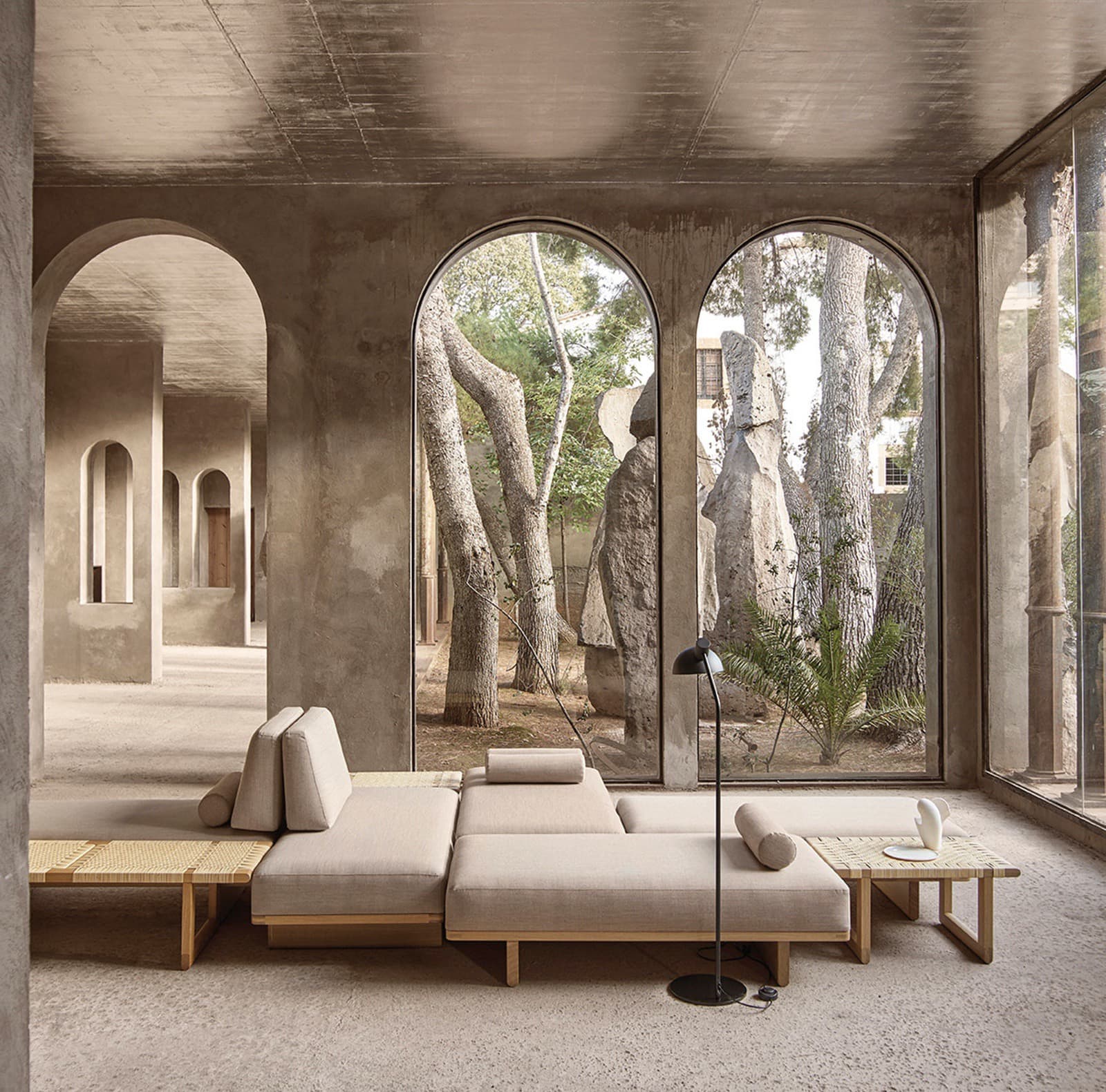
Stretching over two floors and onto the forecourt of the museum, Tobias Rehberger’s major retrospective «through the back side of my eyes» at Kunstforeningen GL Strand in Copenhagen is on view until 14 January 2024. The artist is considered one of the most influential of his generation and was awarded the Golden Lion at the 53rd Venice Art Biennale. At the centre of his interest is playing with perception and the possibility to see, experience and interpret things in a new and different way.

What can visitors expect to see at your exhibition in Copenhagen?
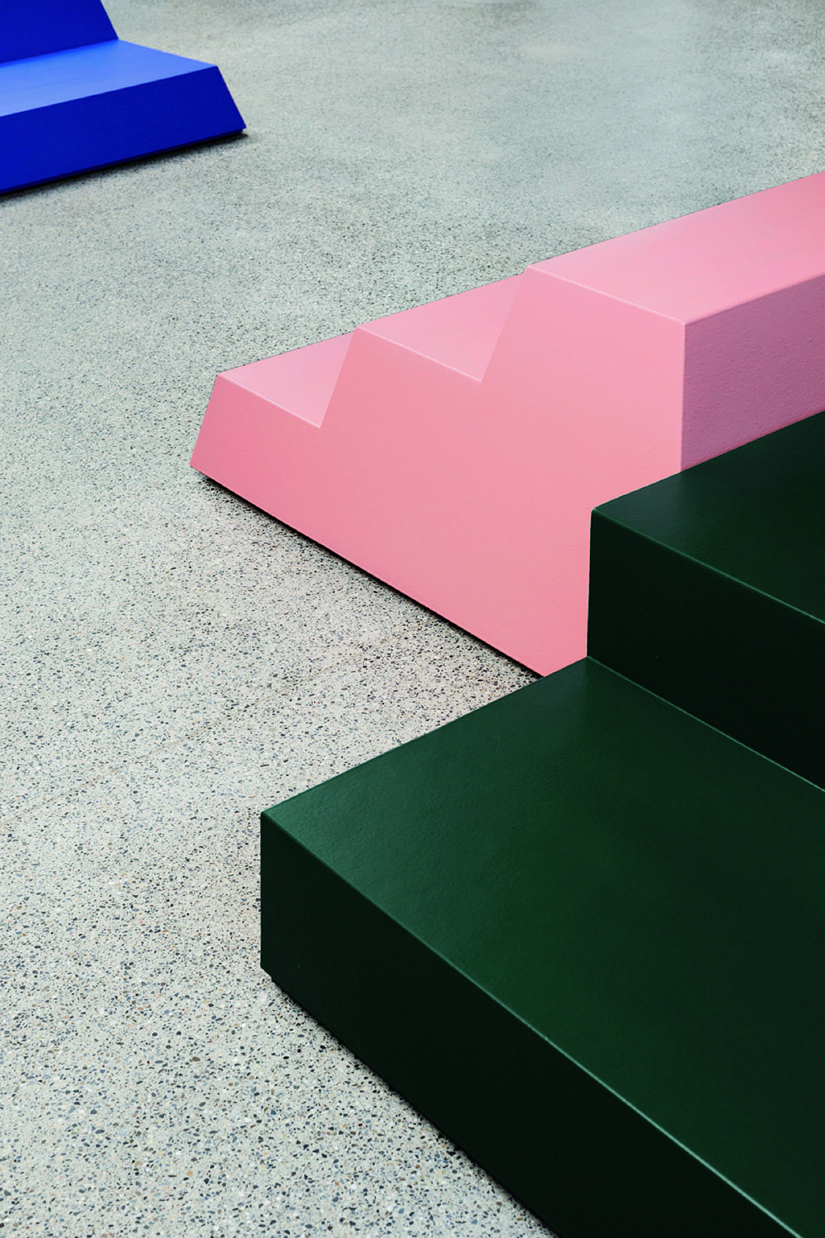
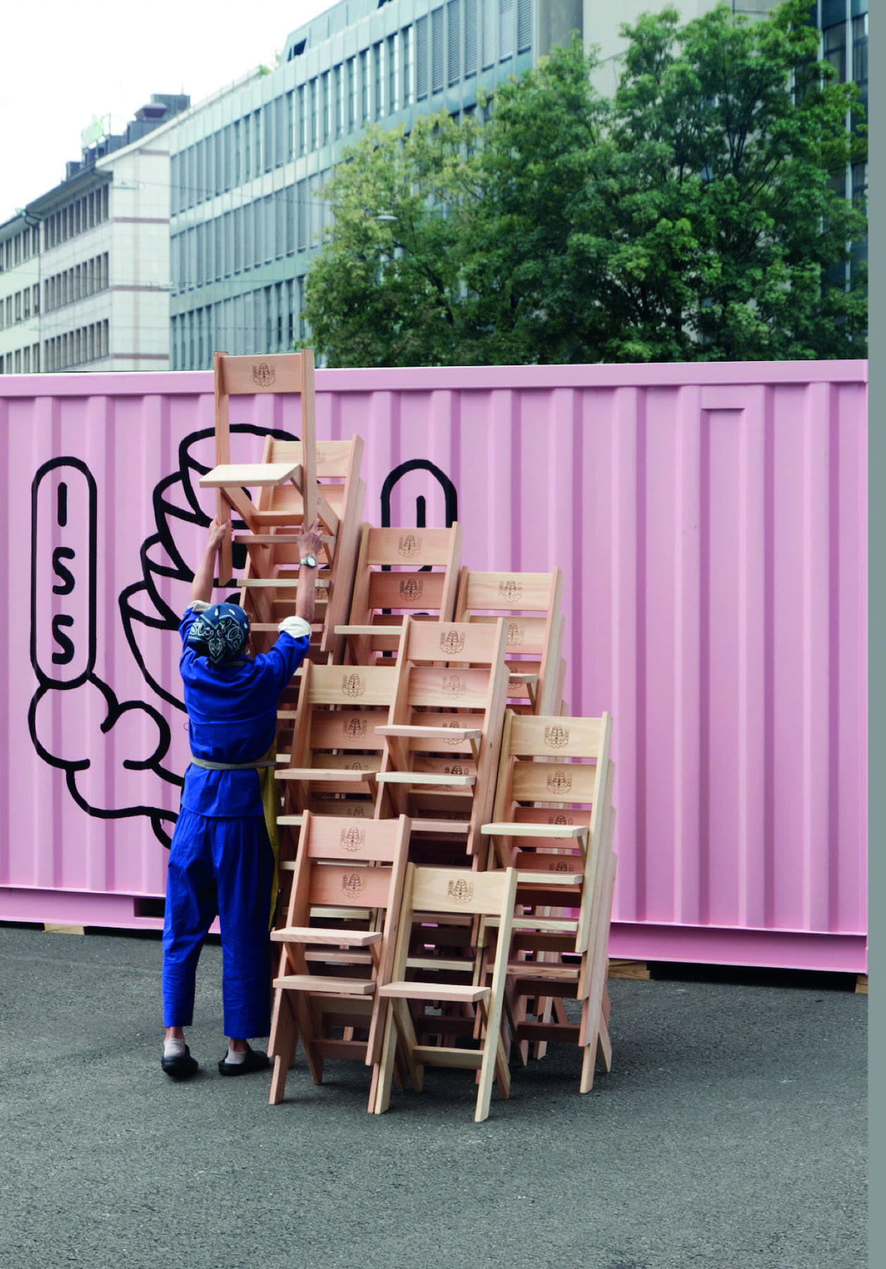
I decided to exhibit works from the last 30 years. Some of them have been exhibited before, these are all works that I had kept to myself. When you make a series with several works, you keep one or the other for yourself. Since the exhibition is taking place in the large venerable Kunstforeningen GL Strand, which used to be privately used, I liked the idea of doing something «private» as well. I did some research and found no other artists who had undertaken an exhibition of this kind before me: This time, it is about the artist’s view of himself when he selects certain works of his. There are also two other layers in the exhibition. On the one hand, I show things that I have amassed over time that do not constitute art – for example, my collection of cookbooks and my collection of teapots – although I have to say that these are not curated collections, but objects that I found good and therefore amassed. I might want to add that there are photos of me that were not taken to be exhibited, but snapshots just like the ones others take.

And the fourth layer of the exhibition is the artwork in front of the museum?
Yes, outside there is façade work that, in contrast to the «private» inside, has to do with the opposite, namely the public. On the first floor of the building, neon boxes are built into the windows, like neon signs in front of shops. They are connected to a pedestal on the forecourt of the museum where you can log your mobile phone in and play your own music. The light of the neon boxes reacts to this music and in a way plays the music and the light version of the piece of music. So this work lets you turn something private like your own music into something that is publicly visible and audible.

What do the exhibits you have chosen have in common?
There are many different reasons why people keep their own works. Sometimes they are particularly successful works or one feels sorry for a work. What they all hold in common is that as an artist you identify with them in some way – it can also be the slightly weirder works that are not so catchy. There is not the same criterion for everyone. That is why it is so interesting – because it is such an ambiguous mass.

Speaking of the artist’s view of himself that is shown – what do you see when you look at the exhibition?
This very view. What that is, everyone has to find out for themselves. That is why I’m doing it. If I knew it so well myself, I could write it down, but then it would be a boring exhibition. It may also be about things that you don’t really want to know yourself. It’s intimate enough that I show you my view of myself. (laughs)

Seriously, that is true. What is the title of the exhibition «through the back side of my eyes» all about?
It is about this view of oneself, which is different from the view forward. When you look through the back of your eyes, you are also looking at yourself. It is a kind of self-reflection. There is a certain parallelism, because neither do I collect my own work strategically, nor do I collect my teapots strategically. So in this exhibition I deal with art in a different way than I usually show it to the outside world. Outwardly, I curate much more than I have now. Curating would be the front of the eyes. What I show here is much more unstrategically selected. Through the back of the eyes, which is also somewhat blind, I have a more unconscious access.

Exciting! Your work brings art, architecture and design together – what fascinates you about this interplay?
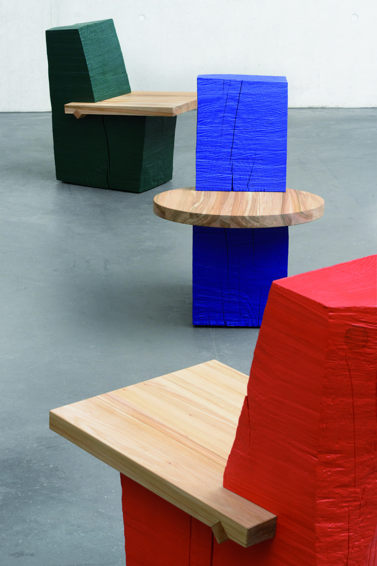
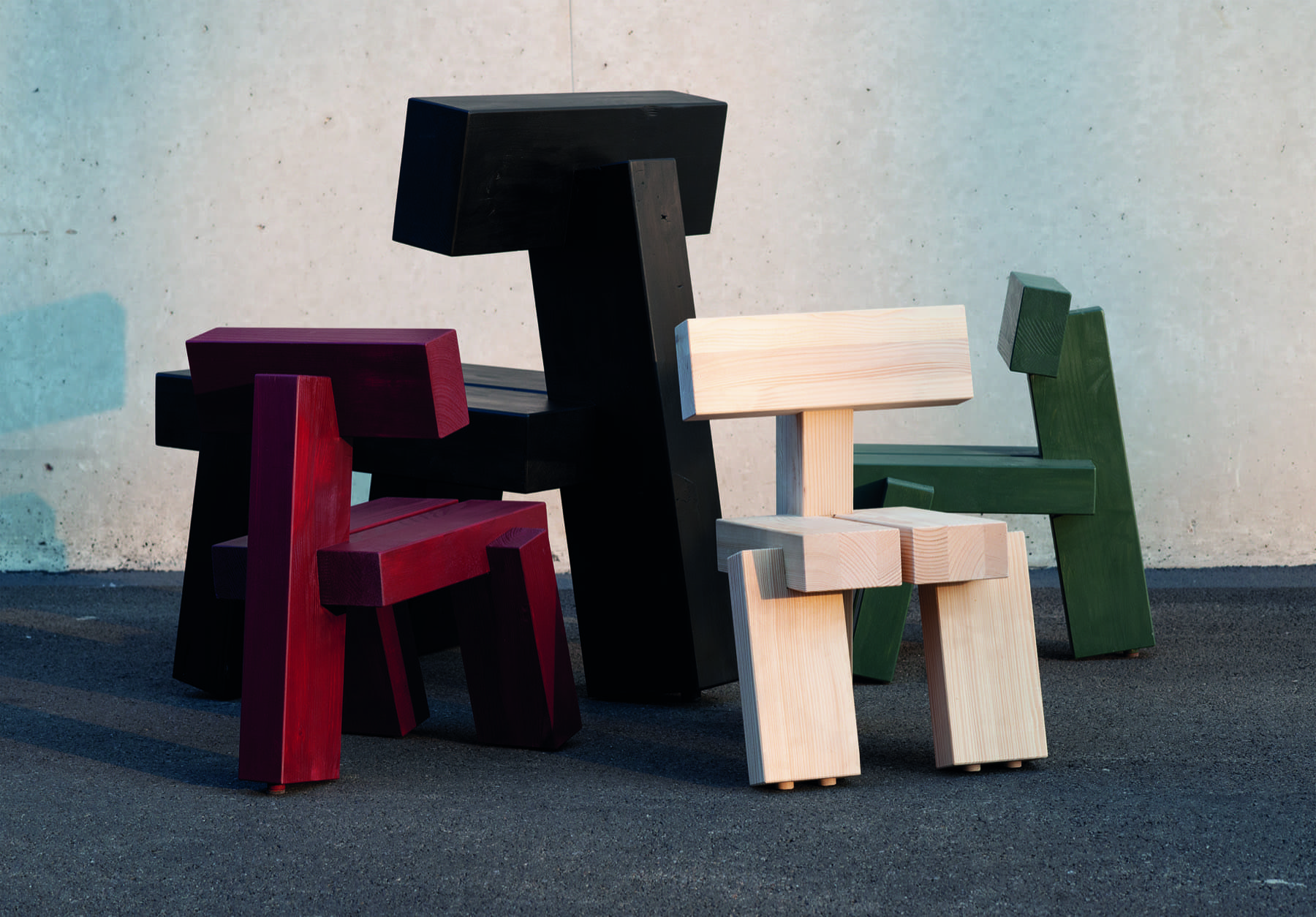
I would like to say I use strategies from other fields like design and architecture but only to find out something for art. Just because I do something with a chair there is no overlap with design – for me it’s always about what that means for the art. What motivates me, for example, is the question of why a chair cannot be a sculpture, why you cannot experience art with your eyes closed, … there are so many things that you are told and that I have also told myself that I suspect are not always true. That is what gets me interested. And my level of suffering is great enough to get up every morning and dive into these questions.

Which idea or project has excited you most recently?
An artist friend of mine, Rirkrit Tiravanija, told me that he wants to build a machine that performs a Japanese tea ceremony. The idea is that you make this absolutely precise ceremony that ideally is the same over and over again, really perfect in a way that is no longer human. The question is whether the tiny differences in human imprecision are not what is actually interesting. One always thinks that precision and perfection are the goal of the tea ceremony. But if you now have a machine that achieves this precision, the idea turns around. The best works of art are the ones  that achieve something like this. Funnily enough, I created some piece of art myself many years ago that dealt with this very question, which is probably why I find it so exciting. I am really looking forward to the work.

Photos Copyrights: Tobias Rehberger, through the back side of my eyes. GL STRAND, 2023. Photo by David Stjernholm, Portrait: SWATCH

Celebrating the art of travel since 1854, this autumn Louis Vuitton is setting off again for new horizons, with the publication of three additional titles in its fashion eye series of photography books: Vienna by Stefanie Moshammer, Hong Kong by Frank Horvat and Deauville by Omar Victor Diop. As with the previous titles, each book reveals a country, region, city or place through the eyes of a fashion photographer.

With affection and wit, the Austrian photographer Stefanie Moshammer plays on familiar clichés about Vienna and offers an unexpected portrait of her hometown, while a selection of largely unpublished black-and-white images of 1960s Hong Kong by the Italian-born French photographer Frank Horvat reveals a city whose teeming streets never seem to grow weary of their thronging pedestrians. For his part, the Senegalese photographer Omar Victor Diop trains his lens on Deauville, the iconic seaside resort on the Normandy coast, exalting its streets and edifices, but also exploring its connections with his native Dakar.
A natural fit for the soul of travel, photography is an evident form of expression for Louis Vuitton, whose editorial process makes sure that the book is granted the status of a medium in its own right, with the singular aim of continually renewing its visual vocabulary. Fashion Eye is a tailor-made series: each type of paper or binding, each layout, and sometimes even the printing processes used, in keeping with artisanal tradition, serve the title at hand. For a book is first and foremost the work of an author, a designer and a printer.

Title after title, a broad compendium of perspectives emerges, one that shifts with the destinations, including urban panoramas and natural landscapes, scenes of local life, and more contemplative work, with images in colour and/or black and white. Each book in the series features an ample selection of large-format photographs, accompanied by biographical information and an interview with the photographer or a critical essay. Fashion Eye gives rise to an unprecedented dialogue between emerging talent, seasoned photographers and fashion photography legends. It confronts contemporary creation with little-known archival treasures to create a collection of invaluable reference works, as much in terms of its approach as its aesthetics.

VIENNA

Embracing the opportunity to work on a project about her native city, Stefanie Moshammer brilliantly crafts visual stories that combine myriad layers of interpretation as she follows the avenues opened up by her formal exploration of elements ranging from the staging of scenes and abstraction to screenshots.
Taking as her starting point the space occupied by Vienna in the collective imagination, along with all its clichés, she delights in entangling her readers in the Austrian capital’s physical and mental mysteries, drawing inspiration from its seminal figures and important historical places, but also eliciting more self-reflective moments, imbued with poignant intimacy.
The result is a narrative like no other, where past and present engage in a rambling conversation in order to better give shape to a certain vision of what Vienna is… or is not.

STEFANIE MOSHAMMER

Born in 1988, Stefanie Moshammer is a visual artist whose practice plays out at the intersection of empiricism and experimentation. After having earned a diploma in textile design from the Viennese fashion school Modeschule Hetzendorf, she studied graphic design and photography at the University of Art and Design Linz, before taking courses in advanced visual storytelling and in social and cultural anthropology.
Moshammer is the author of several books, including Vegas and She (Fotohof Edition, 2015), Land of Black Milk (Skinnerboox, 2017), Not Just Your Face Honey (Spector Books, 2018) and Each Poison, A Pillow (Images Vevey, 2023).

She has received numerous prizes, awards and other honours, and her work has been published in various print and online publications such as i-D, Art – Das Kunstmagazin, ZEITmagazin and Harper’s Bazaar. Her photographs have been exhibited at galleries and museums in Austria, but also across Europe and inthe United States, China and South Korea.

HONG KONG

In 1962, the German magazine Revue asked Frank Horvat to team up with the writer Dieter Lattmann to create a number of features on major cities around the world. In late 1962, the duo thus arrived for a stay in Hong Kong,then under British rule, which had been seeing a massive influx of refugees from China over the past 10 years.
Horvat was fascinated to discover a dense city laid out vertically, packed with people, dwellings, objects and symbols, where empty space was unimaginable. It perfectly suited the photographer’s style because he liked to compose his images in black and white, filling the frame with his subject. As a large part of the commissioned work was not included in the published article, most of the images appearing in this book have never been seen before.

FRANK HORVAT

Born in Italy in 1928, Frank Horvat grew up in Switzerland. He made his way to Paris in 1951, where he met Henri Cartier‑Bresson, one of the founders of Magnum Photos, whose influence would be decisive for him. Horvat settled in Paris in 1955 and rapidly gained recognition through his photographs taken with a telephoto lens and his interest in capturing nightlife scenes in the French capital. His sharp journalist’s eye would serve him well for his fashion images, featured in publications such as Jardin des Modes, British Vogue and Harper’s Bazaar. Favouring shots taken in the streets, he brought a freshness and vitality to fashion photography, thus playing a key role in its revival.

After his round-the-world trip for Revue in 1962 and 1963, Horvat rarely worked again as a photojournalist. Beginning in the 1970s, he turned his attentions to more personal work, with each project giving rise to a book or an exhibition. He died in Paris on 21 October 2020. Horvat’s work has been the subject of many retrospective exhibitions, the most recent of which was presented in 2023 at the Jeu de Paume in Paris.

DEAUVILLE

Omar Victor Diop has attracted notice through works bringing together a visual artist’s sense of colour, atmosphere and composition, the world of fashion, and portrait photography. In 2022, with the aim of presenting a creative residency hosted by the Planches Contact festival as a title in the Fashion Eye series, he was invited to Deauville, where his project emerged as a trek through the streets of this seaside resort on the Normandy coast, whose landscapes reminded him of the Atlantic Ocean beaches of his Dakar childhood. Diop redraws and heightens the impact of the resort’s houses and other buildings, making them the theatre for a personal odyssey, with cameos by other characters and alter egos, all manifestations of his inner thoughts as a Dakarois abroad.
This new series, perhaps the first one by Diop that is truly autobiographical, juxtaposes present and past, composite identities, and the values, traditions, voices and ideas of different cultures.

OMAR VICTOR DIOP

Born in Dakar, Senegal in 1980, Omar Victor Diop was brought up there and now divides his time between his birthplace and Paris. Fascinated by photography, literature and history from a very early age, the convergence of these interests became fertile ground for his vivid imagination, leading him to hone his talents in several art forms, from collage and creative writing to fashion and textile design. An invitation to take part in the ninth edition of the Pan-African photography biennial. Rencontres de Bamako (Bamako Encounters), held in 2011 in Mali, marked the beginning of Diop’s professional career as a photographer.

His works are in the permanent collections of major institutions and have been shown at exhibitions as part of high-profile international events. Diop’s images also appear regularly in magazines around the world, gracing the pages of Harper’s Bazaar, Spanish Vogue and Madame Figaro, among others. His first monograph, Omar Victor Diop, was published by 5 Continents Editions in 2021.

Photos Copyrights: Louis Vuitton

Sebastian Marbacher belongs to a new breed of prominent Swiss designers. His word has received several awards and encompasses the interplay between (product) design, art and architecture.

He designs furniture, products and rooms. His objects are accessible, always suitable for everyday use and often have minimalist lines without losing their playfulness. Sebastian Marbacher is a creative inventor, an aesthete. Born in Lucerne in 1986, he initially completed an apprenticeship as an engineer and followed this by studying industrial design at the Zurich University of the Arts. In 2013 he founded Studio Sebastian Marbacher in Zürich and, in addition to his own projects, works successfully with well-known companies and institutions. A conversation about reduction, chairs and artistic issues.

Sebastian, let’s start at the beginning: Which memories do you consider to be formative for your creative career?
Maybe that my father always had a workshop and often worked with wood. In one house we lived in, the kitchen, workbench and fireplace were all in one room. For me, cooking, sitting together at the table and working belong together to this day.

Talking about sitting together – chairs are a very common feature of your work …
That’s how it’s turned out over the years. When I first started, I never had the idea of designing a chair. In the course of my search, however, I keep coming back to the subject of ‘sitting’. For me, chairs are also a good size as an object. You can carry, rotate it and hold them. This simplicity and independence of chairs represents something exciting for me.

Simplicity as a keyword – your work is minimalist and yet there is something playful about it …
I’m actually interested in reduction, but not to the point where there’s nothing original left. I’m interested in reduction in order to extract what seems essential to me. Clear lines and compelling stories.

Like your Basic Chairs, for example?
Yes, in fact, at the beginning there was the question what‘s needed to sit? How minimal can the seat and backrest be? In addition, I was excited by the idea of finding a geometry that would allow stacking. The design then developed over several prototypes.

Originally an engineer, mechanical draftsman, now designer and scenographer – how has your questioning changed over the years and what challenges you?
In mechanical engineering, the cheapest and simplest solution is always sought. I had a lot of fun with this. But today, for me, it’s about opening up completely. Everything is possible and I often work with many different variants at the beginning. That’s a whole different challenge. What interests and fascinates me is the question of what is functional. Does the function come first or can an object communicate or even annoy first of all?

And what makes a task particularly exciting for you?
Difficult question, I think the variety and multiplicity of projects is most important. Location-specific projects are always exciting challenges for me. New places and people and framework conditions.

Upcycling of materials is always a theme with your objects. How important is sustainability?
On the one hand I am a designer, on the other hand I am a consumer. In both roles, I make decisions that involve considerations of sustainability. For example about materials, short transport routes or production facilities. The Basic Chair is produced for Switzerland and Italy, for a Japanese label in Japan itself.

In the face of abundance – as a product designer, don’t you start to ponder?
Designing new products is of course part of this controversy. You see the mountains of rubbish and the things that cannot be repaired. However, if you develop a new product that can be manufactured or operated three times more efficiently with regard to resources or energy, then that is a positive step.

Let’s get to your latest project. Rumour has it that it has two wheels?
Correct. It’s a collaboration, but I can’t reveal too much about it just yet. It’s about a bike that combines the advantages of small wheels with the advantages of a large luggage rack. I am convinced that the «bicycle» as an umbrella term still offers a lot of potential if we look at the changes in society with the inner cities and the large number of people.

You also work regularly with your partner and textile designer Mara Tschudi. What’s it like, working and living together as two creative people?
Since I’ve known Mara, there’s been an exchange in both directions. Her world of colours plays an important role in my projects. We come from different disciplines and complement each other very well in the sense that my work is very analytical, planned and derived. And from a human perspective it’s extremely valuable that we can just share that and understand what the other is about.

Finally: How much furniture is self-made in your home?
Some of it. And there’s a long to-do list of projects (laughs). Our interior is actually an ongoing construction site. For me, this is also a kind of field research without the pressure of having to present a result. And you can only be completely free if you know that you can also fail.

Photos Copyrights: Dominik Zietlow / studio sebastian marbacher

His name is known around the world, but few know who the street artist Banksy actually is. Those who know do are keeping are silent. And the man himself? He gives people reasons to talk about him …

A long line of people is standing in front of Hall 622b in Zürich-Oerlikon. People full of anticipation, curious people. Because they all want to see the current exhibition featuring around 150 works by the world’s currently most high-priced artist. We’re talking about Banksy. Internationally known as one of the best street artists in the world. And a mystery. To this day there is only speculation as to who is behind the stencil graffiti with its huge recognition factor. So it is fitting that the exhibition in Zürich is entitled «The Mystery of Banksy – a genius mind. The unauthorised exhibition». Because when an author does not officially insist on his rights, authorisation is difficult. Banksy is a phenomenon. One with influence.

An exceptional talent from day 1

He is an exceptional phenomenon and his anonymity, which has been preserved for decades, of course makes that even stronger. In addition, he is absolutely direct. His art is always socially critical – and has been from day 1. The first works appeared in Bristol, England, as early as the 1990s. Initially, Banksy worked here with other graffiti artists. Then, thanks to fellow artist «3D», he discovered stencil art. Or to put it in his own words from an anonymous interview: «When I was about ten years old, a boy called 3D was the first to bring spray paint to Bristol. So I grew up with it and graffiti was what we all loved at school and did on the way home from school.»

He created his first large mural one night in 1997. It was entitled «The Mild Mild West». It was an image of a giant teddy bear throwing a Molotov cocktail at three police officers. The legend of Banksy was born. And it was clear to everyone that this artist is hiding behind a pseudonym, but hardly anyone denounces capitalism, society, the economy, politics, cultures as blatantly as he does – and people celebrate that, at least for the most part. The first rays of sunshine in the morning suddenly illuminate smooching police officers in Soho, a girl with a gas mask in Barcelona or a pair of scissors on a border wall in Israel. Cynical wit paired with humour, as his style is often summed up. And a style that receives worldwide attention.

His identity is practically a state secret

The fact is, there are people who know who Banksy is. Starting with 3D, who by the way is now the front man of the band Massive Attack under his real name Robert Del Naja. But the fact is that all these people are keeping silent. It doesn’t matter whether it’s his first companions or active artists, musicians and creative people who know him personally. And that bothers a lot of people. Among other things, the Daily Mail has undertaken extensive research into who is behind the pseudonym. Based on this, scientists at Queen Mary University in London used forensic and static methods to track down Banksys. Incidentally, methods that are actually only used in the search for serial killers and serial offenders.

Both the Daily Mail and the university researchers came to the conclusion that Banksy is the British artist Robin Gunningham. But Gunningham himself is having none of it. Others believe that 3D is Banksy, again various different comparisons were made when it came to where the band performed and where new images appeared. In 2003, Banksy also gave an interview to ITV News correspondent Haig Gordon. With a baseball cap and a T-shirt over his nose and mouth, he says, among other things, in the 35-second-long appearance: «I’m covered because you can’t really be a graffiti writer and then go public.» And Gordon himself insists that although he saw his face, he can’t remember it.

Headstrong and yet in the spirit of the community

What Banksy thinks of commercial art is anyone’s guess. But on the other hand, he has also made his views more than clear. Starting with the fact that he renounced his copyrights, with the statement «Copyright is for losers», to the day he destroyed one of his most famous works after it had secured the highest bid. No sooner had the hammer fallen at Sotheby’s for the «Girl with Balloon» for an amount of EUE 1.2 million when a shredder built into the picture began to destroy the work. Due to technical problems, it was finally only half disassembled into its individual parts. Fun fact: three years after the incident, the half-destroyed picture came under the hammer again under the new title «Love is in the Bin». And found a new owner for EUR 18.9 million.

Certainly, both the lack of copyright and transferable ownership rights mean not all the proceeds go to Banksy. Nevertheless, he earns a decent sum. And he wouldn’t be Banksy if he didn’t know how to use that for his own convictions. For example, in May 2020 he had his painting «Game Changer» hung exclusively in a hospital in Southampton and then auctioned off to benefit the National Health Service in the wake of the Covid pandemic. At that time, the highest price ever paid for a Banksy painting was EUR 19.5 million. The artist is also the financier and originator of the sea rescue ship «Louise Michel». This bears his drawings and is used to rescue refugees who try to cross the Mediterranean Sea in rubber boats and in so doing get into trouble.

And the story goes on …

Banksy is now believed to be in his late 40s or early 50s. It is therefore likely that new surprises will await people under his name in the coming years. It’s rather doubtful that he will one day appear in front of a camera and reveal his identity. And that’s actually a nice thing in an age when people promote their lives and their loved ones on every social channel going. Incidentally, those waiting in Oerlikon all agree.

Photos Copyrights: Dominik Gruss, Getty Images

Clarity, contemplation, class – that is what characterises the works of the Belgian designer and architect Vincent van Duysen. The 61-year old designs furniture as well as hotels, stylish offices and rooms for Kim Kardashian.

What are you working on at the moment?
I’m interested in the wellbeing of people in general and a general serenity in the world. I would like to contribute something to it. I do that by first understanding how people live in their houses, inhabit their homes, their rooms. I incorporate this knowledge into my work.

Have you always wanted to be an architect?
When I was a child, my parents introduced me to many different forms of art, which was a crucial influence and the foundation of my appreciation and understanding of beauty. They also nurtured a natural talent for creativity in me from an early age. I chose architecture because it covers so many aspects of all applied arts and is therefore an all-round course. But it could also have been photography, cinema, fashion or something similar. Architecture gave and gives me the opportunity to express my creativity in many different ways and thus to contribute to the art of living.

You live and work in Antwerp, what fascinates you about the city?
Antwerp is very cosmopolitan, especially when it comes to arts, craftsmanship and culture. The city offers an enormous range of creative outlets, from theatre to performance, dance, fashion to architecture, involving many people, but in different and unique ways. Antwerp is my home, it influences, ‘contaminates’ me in a way, but at the same time it’s one of my two homes where I can also recharge my batteries and feel protected.

What do you love about your work?
There are many aspects that I like about my job. First, that I work first and foremost for people to improve their lives in organic and timeless ways. I also like the fact that my job gives me the opportunity to nurture my creativity and the ability to respond to change without constraints. I also love absorbing the most diverse disciplines like a sponge. Anything has the potential to inspire me: a documentary on YouTube, a picture of someone I follow on Instagram, a book, an artwork, all kinds of visual stimuli, books, galleries, films… Everything goes through the filter of my empathy and my imagination – and from this I draw and create. But I’m only at my most creative when I’m surrounded by people. I think everyday life, everyday encounters are what inspire me the most. And my travels. And my team!

How do you breathe soul into a room?
Since the beginning of my professional career – 30 years ago now – the most important thing has always been to consider architecture as a profession dedicated to people. This means that residents of a place, a piece of architecture, an interior space, need to feel protected and relaxed. This also applies to the furniture and objects around them that they need for a comfortable and happy life. I bring soul to an environment or space by infusing tactility, timelessness, organics, texture, serenity, comfort, natural materials, light and exquisite craftsmanship.

In such a space, people then feel …?
At home. You feel comfortable, protected, inspired. In my work, the focus is on people. That is why I design or plan primarily for people, for their wellbeing, for their serenity and calm.

Do you have a favourite project from your portfolio?
Each project is different in context, location, connections, use and purpose, making it difficult to prioritise some over others. Also, I always design with a narrative in mind and in that sense my projects are a sequence of a more comprehensive «big picture». Still, there are some key projects that come to mind because you always create an emotional connection – such as Casa M, my holiday home in Portugal.

How do you view the trend towards colour and opulence in interior design?
I don’t follow trends, I always try to be true to myself, putting the customer first and creating spaces, buildings or objects that improve people’s lives.

How do you work best?
My design process never stops, I am always designing in my head – never in front of a ‘blank canvas’. I like to be as observant as possible and have a strong visual approach. I regularly meet with my team and discuss ideas and directions to achieve a shared vision. My ceaseless inspiration comes from travel, conversations, exhibitions, people and everyday life.

What are you currently busy with?
With many projects in parallel… residencies in Asia, Belgium, USA, Berlin, projects for Molteni&C | Dada, Zara Home, Flos, hospitality projects in Portugal, too many. In short, too many to list them all.

Is there a dream come true project besides all this?
Nothing in particular, but in general I want to keep creating and designing new examples of architecture, products and interiors, creating something for humanity in an organic way, creating timeless objects. I want to travel more. To be able to work in countries I haven’t been to. I just hope that we won’t build and produce too much because we have to care about the world and think more in terms of timeless structures and objects. In terms of future endeavours, I generally enjoy seeing each project as an opportunity to try out new or unexpected ideas. I’m always designing in my head. Renewing and developing this common thread that runs through my work again and again is a welcome challenge. I look forward to surprising my clients and bringing a sense of integrity and individuality to every project. At the same time, I want to work with people who challenge me, with whom I have creative chemistry and a strong interaction. I enjoy working with people and clients who push me out of my comfort zone.

“My design process never stops, I am always designing in my head – never in front of a ‘blank canvas’.”

Photos Copyrights: Piet Albert Goethals, Mark Seelen, Alberto Piovano, Hélène Binet,  Max Zambelli, Matthieu Salvaing, Vincent Van Duysen, Koen Van Damme

FRITZHANSEN,Series7 ©FritzHansen

Following a forced break the Interior Design exhibition «neue räume» (new rooms) recently took place again for the 11th time. Approximately 100 exhibitors met in the old ABB-Hall in Zurich Oerlikon, to present living trends, product innovations and design objects.

The established Design exhibition is considered as an important presentation area and significant meeting place for the «Who is Who» of the furniture scene as well as for design fans beyond the borders of Switzerland. As an additional highlight to the innovative manufacturers from home and abroad with their new products, «neue räume» traditionally shows current and future living trends in various special events. The design world returns to the stage in Zurich with an exciting program of events, interesting product innovations and culinary discoveries. 

VIFIAN MÖBELWERKSTÄTTE AG, Das modulare Aufbewahrungssystem TriobyMiaKepenek,BlackEdition ©MiaKepenek

Colorful and radical

One of this year’s special events was the exhibition «Frauen im Design» (Women in design). It presented well known furniture and objects from designers, who have been making a name for themselves with their designs since the beginning of the twentieth century right through to the present day. Additionally the association «mobiglias – Handwerkskunst aus Graubünden» (Craftsmanship from the Grisons) looked for furniture and objects in a design competition which have a connection to the Grisons and were also handcrafted and preferably are made of local materials. The members of «mobiglias» manufactured the winning works as prototypes and presented them for the first time at the special event. As hoped – and expected – internationally renowned furniture manufacturers were again represented this year. In line with the motto «Wohnen ist da, wo wir uns wohl fühlen» (Living is where we feel at home), the (possibly not yet worldwide) well known Swiss furniture workshops  «Vifian» from Schwarzenburg thrilled us with the stylish entrance hall furniture «trio», which captivates with its delicate look as well as its versatility. Modular, courageous and multidimensional! The brands «Gufram» and «Memphis Milano», which are now also part of «Italian Radical Design», certainly made a trendy appearance. The newly named group was founded with the goal of reinforcing Italian design brands that stand out thanks to an unmistakable and non-conformist approach. In Switzerland both labels are exhibiting together for the first time at «neue räume 22» and amongst the predominantly discreetly colored furniture pieces at the exhibition the colorful furniture world of the Italians was unmissable. Fritz Hansen was fortunately also present, this time with a selection of cuddly lounge chairs and of course Tom Dixon could not be overlooked, celebrating his 20 years in business this year as well as Magis, Minotti, wb form, Skagerak, ClassiCon or embru, to name but a few.

OREA, Caminada © A. Herger

©ConstantinMeyer

Très chic in the laundry room

In addition to furniture and objects there was also something exciting to see from the Swiss textile and laundry world. For example the company Christian Fischbacher which has been producing sensual and aesthetically outstanding home textiles for over 200 years. In conjunction with the architect and designer Hadi Teherani the joint «Contemporary Persia Collection» has now been extended by two hand-tufted carpet models. The pattern and colors were inspired by designs from Iran and combine the finest merino wool with shimmering silk and bamboo. The company Schulthess proved to us that doing the laundry can also be chic with an elegant washing tower that does not have to hide in the dark linen room. And the special program item «Orea meets Caminada» verified that cooking is also linked to design. The three-star Michelin chef, Andreas Caminada, created the cooking island «Orea AC» in cooperation with David Spielhofer. Ores plans kitchens as a project very close to their hearts, the kitchen should inspire and motivate you to cook yourself. Presented by Anna Maier, Andreas Caminada introduced the classic design with its fascinating materialization. 

CHRISTIAN FISCHBACHER, Contemporary Persia Moodboard © Jonas von der Hude

GUFRAM, Sofa Bocca Another green cactus © Gufram

GUFRAM, Magritta series © Gufram

CHRISTIAN FISCHBACHER, Contemporary Persia Collection, Teppich Afsun © Christian Fischbacher

Interior design in japandi style means creating a stylish, free and open space.

You take a considerable portion of Japanese minimalism, add an equally generous amount of Nordic Design – and the living trend for 2021 is complete. „Japandi” is a mix of the popular Scandinavian “Hygge” style and the Japanese Wabi-Sabi philosophy, which is also considered the concept of the perception of beauty. Evident core elements of Japandi are natural colors, simple shapes and primarily wood. While the northern Europeans contribute lighter colored spruce or oak wood to the interior, the Asian area provides darker Design pieces in acacia or walnut. A stylish example of this is a solid oak wood table, flanked by dark wooden chairs.

less is more

The natural factor also comes to the fore in the choice of materials. Linen, jute, cotton, paper, rattan and ceramics are used, and preferably in the colors brown, beige or terracotta. Complimented by optical highlights in indigo, emerald and aubergine. The basic philosophy behind Japandi is to concentrate on the essentials and to omit everything superficial.

Therefore no surprise that the living trend is particularly appealing to minimalists. Decoration articles and other accessories are not completely banned from the room, they are simply placed consciously and generally as a functional eye catcher.

A wall mirror, which makes the room appear optically larger, or intentionally placed light islands as well as plants that attract our gaze and calm our over stimulated senses, that’s decorating in Japandi style. Two well-known elements from the Japanese furnishing style are a must: Room dividers, the so-called paravents, and low pieces of furniture for example a futon bed or a proportionately lowered sofa. Ceramic vases with Japanese characters are also an essential statement. Cushions and blankets as a functional accessory are inspired by “Hygge”. Important to note: Never exaggerate and ask yourself with each piece whether it is really (still) necessary.

A place of rest

The term Japandi is, by the way, a blend of the two terms “Japan” and “Scandic”. And, we have to be honest, not a completely new style. Roughly 150 years ago Danish architects were inspired by the simple elegance of the living style on their travels to Japan. But the clear and extremely modest look has only now come to take its place in our homes. Whether the reason is that we are all more at home now and despite restricted freedom of movement miss the desire for generous dimensions, remains to be seen. The fact is that Japandi provides a stylish, cozy haven. And that does everyone good – always!

Photos Copyrights: Pfister, Carl Hansen, IMM Cologne/Kettler/SICIS, Vitra, COR, Shutterstock